

What Can Rave Posters Reveal About a City?
From deindustrialization and decolonization, rave posters around the world trace how cities transform and reinvent themselves.

![[animate output image]](https://substackcdn.com/image/fetch/$s_!TnZp!,f_auto,q_auto:good,fl_progressive:steep/https%3A%2F%2Fsubstack-post-media.s3.amazonaws.com%2Fpublic%2Fimages%2F250893db-d28f-40ae-9ede-5d64c98a93d2_1620x1080.gif "[animate output image]")
A 2019 photo captures a street-level banner proclaiming, “the original modern city.” It’s hard to recognize where exactly this was shot, because for all the sign’s bluster, the cityscape behind is unremarkable. All you see is a construction site, accompanied by a few nondescript buildings.
Read the fine print some more, and “the original modern city,” as the banner claims, is not Tokyo or London or New York or Shanghai. (The background probably would’ve given it away instantly). Of all places, this photo was taken in Manchester.
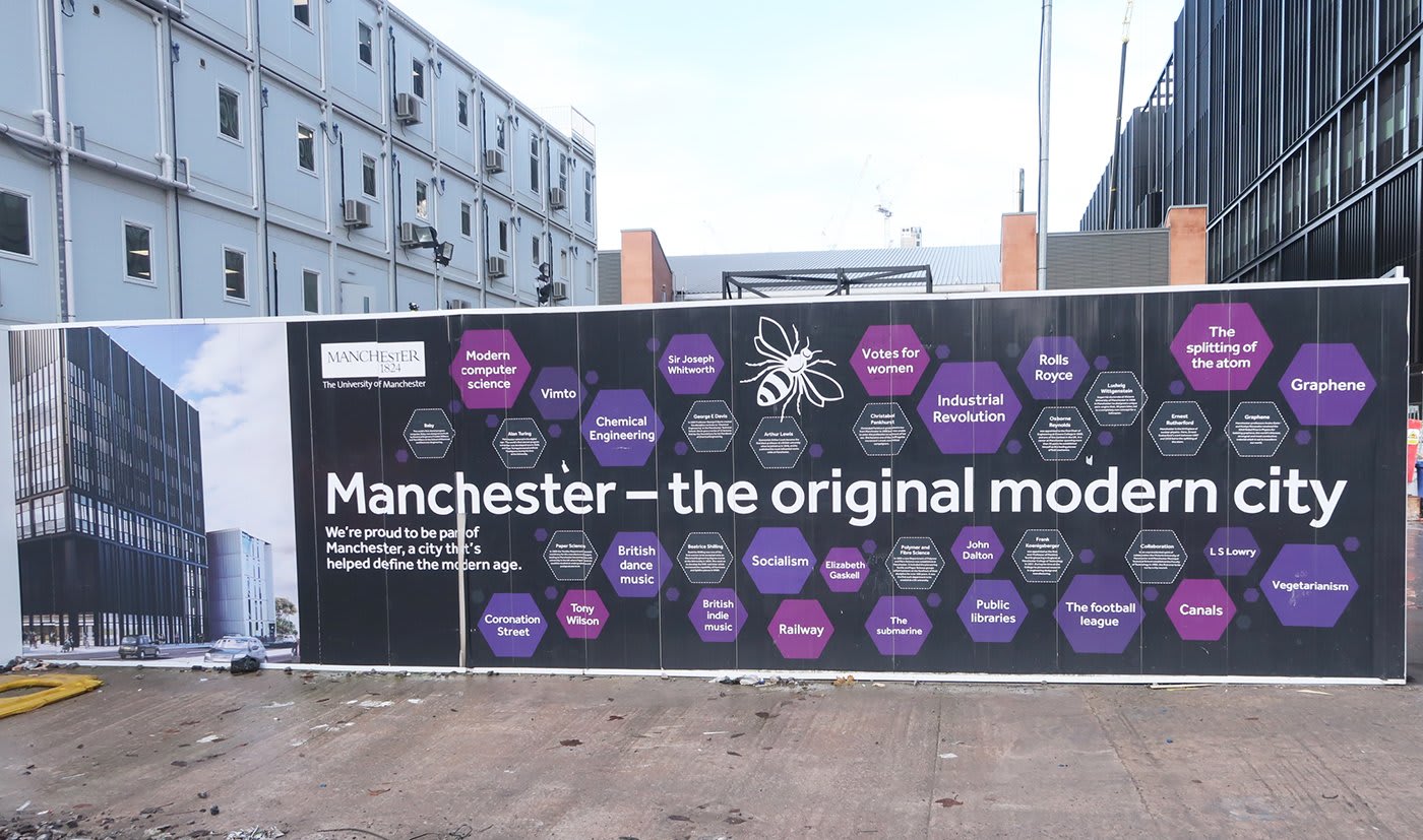
In the late 18th century, the northern English city was only a small market town of 40,000, but when the Industrial Revolution swept Great Britain a century later, Manchester found itself at the center of the country’s textile manufacturing industry. By 1900, its population was just shy of two million and it was officially one of the world’s ten largest cities, at the heart of global trade. In the words of the American literary critic Steven Marcus, “[Manchester] was the principal site of what was rapidly coming to be thought of as the Industrial Revolution.” And so, the “original modern city” was born.
Today, Manchester is mentioned more often in trashy British reality TV than in serious discussions about the global economy—a fall from glory that accelerated during Margaret Thatcher’s tenure as Prime Minister, when a wave of deindustrialization crippled the city’s economic engine.
Between 1979 and 1983, the UK lost 1.7 million jobs in manufacturing in Thatcher’s first period of power. Manchester, as an industrial hub, was particularly affected. And as the city’s factories and cotton mills slowly emptied, and its industrial glory quickly faded, one industry attempted to cement the “original modern city’s” history into memory: nightlife.
In 1982, The Hacienda, a local nightclub, opened in the space of what was once a boat showroom in Manchester’s city centre. At its peak, The Hacienda was “at the forefront of music and youth culture” and, according to VICE, soon became “the spiritual home of acid house music.” Although its early days were filled with performances by punk, rock, and new wave artists, the nightclub set the ground running for rave culture as directly derivative from (and adverse to) Thatcherite economics. When Thatcher’s relentless pursuit of neoliberalism saw manufacturing jobs outsourced to foreign countries, what you were left with, as the journalist Ed Gillet writes in Party Lines, were “the masses of unemployed and antagonized young people desperate for some form of release” and deindustrialized spaces waiting to be reappropriated for collective pleasure.
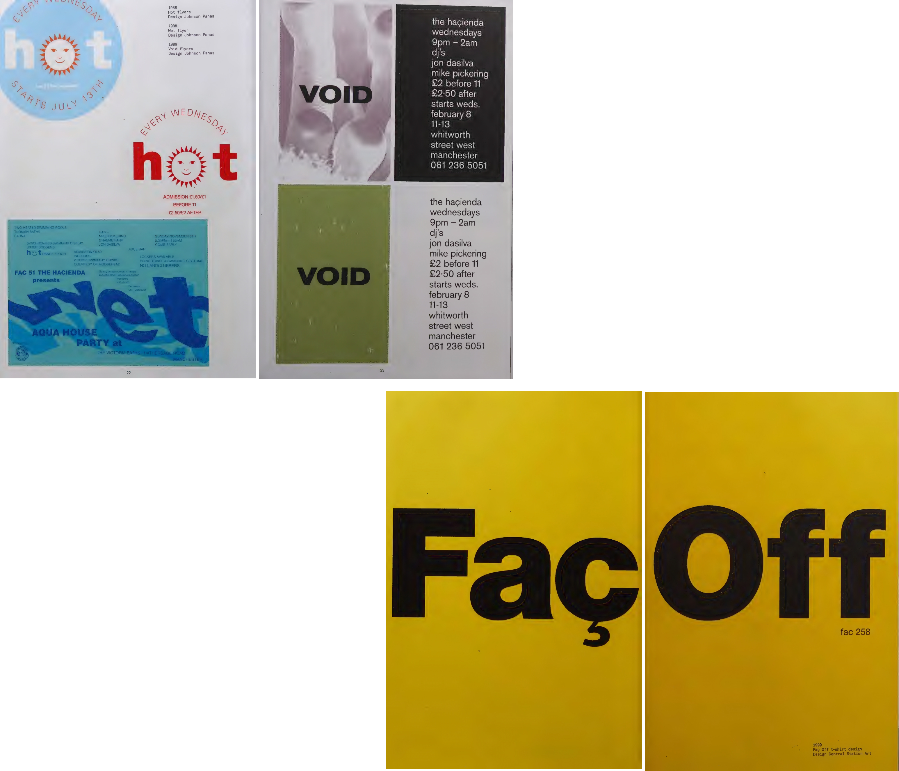
That’s the kind of story that is narrated best by the designs of The Hacienda’s early rave posters, which, as Bill Brewster writes in Clubbed, “[were] the embodiment of postindustrial chic.” In use were motifs like hazard stripes and rough squared edges. Colors on rotation were exactly the kind you might find at a factory: yellow, red, and black. Typefaces were layered on top of one another with a careful, machine-like precision. The Hacienda was once a boat showroom, but looking at the event posters, you can’t help but wonder whether a manual printer was left behind in the backroom, free for the club’s founders to use.
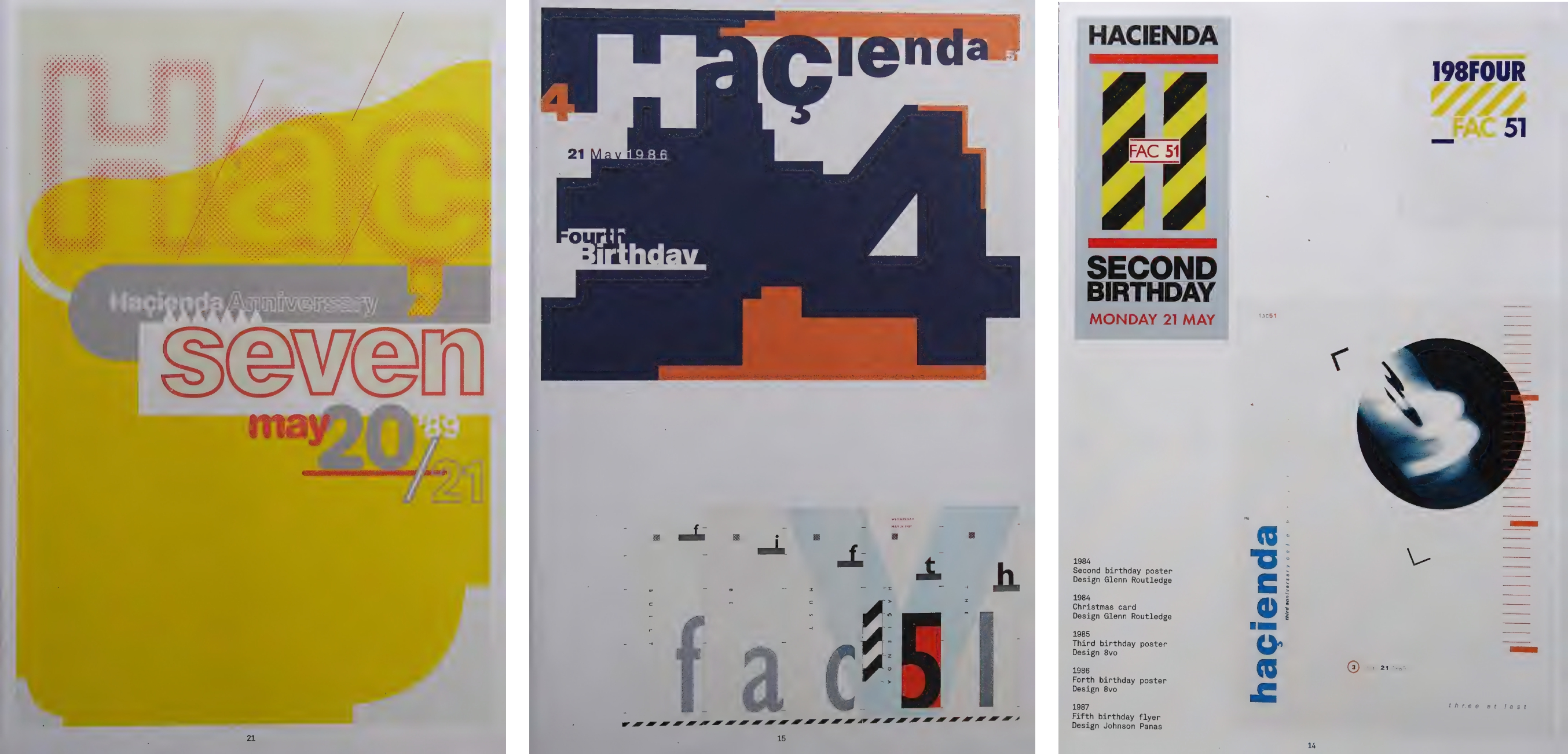
“Through The Hacienda, this emblematic gesture is made that the first industrial city in the world re-emerges as the post-industrial city,” Peter Saville, the graphic designer in charge of the project, said. “It’s like Alien regeneration.”
These rave posters can highlight tensions in a city, and visually reveal changes that might be left unsaid. Another example of this is an old poster from Hong Kong advertising “UNITY,” a 12-hour rave hosted at the night of the city’s handover from Great Britain to China.
A few months before the Hong Kong handover, local club promoter Andrew Bull stumbled across a propaganda poster in a Beijing wet market. “The whole nation celebrates Hong Kong’s return to China,” the poster read.
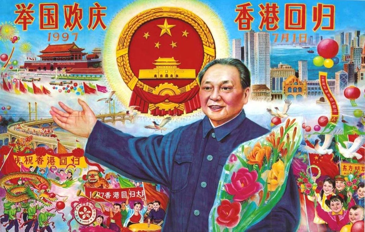
“It was a Eureka moment,” Bull recalls in an interview with That’s Shanghai. “Up until that point almost no large-scale, privately-run entertainment event had been announced in Hong Kong to coincide with the handover weekend.”
Bull was so inspired by the original propaganda poster that he recycled it to advertise UNITY. The end result is a state communication medium repurposed for Hong Kong nightlife: it presents Deng Xiaoping, then paramount leader of the CCP, jubilant, with full, round, rosy cheeks—a marker of vitality and good fortune. In the background, citizens are in equally joyful celebration, performing a dragon dance and raising balloons to the sky. The poster’s motifs could’ve been pulled straight from a Communist mood board—shining five-pointed stars printed with a statist block-y sans-serif type that spells out the event’s details. Time: “10PM TO 10AM”; Location: “KOWLOON BAY”; Marketing copy: “THE GREATEST MOST HISTORICAL MUSIC EVENT IN THE ENTIRE HISTORY OF HONG KONG, IF NOT THE WORLD.”
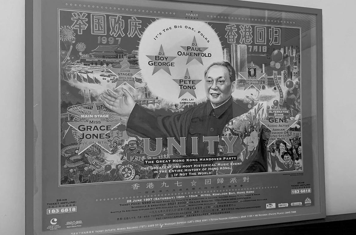
Around 12,000 people wound up attending UNITY, partly for the killer lineup featuring Grace Jones shaking ass and Boy George manning the DJ booth, but also to party as the very DNA of the city changed overnight—from British colony to Special Administrative Region of China. It’s the kind of story that I think is effectively advertised by Bull’s remixed poster. The statist motifs and the acutely Chinese symbols of joy chart a very optimistic and very patriotic vision for the city. Any semblance of British-ness—even that the event would be broadcast on the BBC—was effectively obscured. The future of the city, of course, was Chinese.
In events I frequent today, I’m noticing an emerging subgenre of rave posters from designers in East Asia. It’s all very futuristic. There’s plenty of 3D modeling that’s both hyper-detailed and cartoonish, in the style first pioneered by SEGA fighting games and later adapted by video gaming companies across the region. Plenty of depictions combine mythology and spirituality with a darker, more sinister cyberpunk aesthetic: a ghostly mech suit, a computerized yin and yang, a medievalized lightsaber. All designs are very Elden Ring meets TRON or Game of Thrones meets Ghost in the Shell, reminiscent of games you can only find in dark, overlooked corners at an Akihabara arcade.
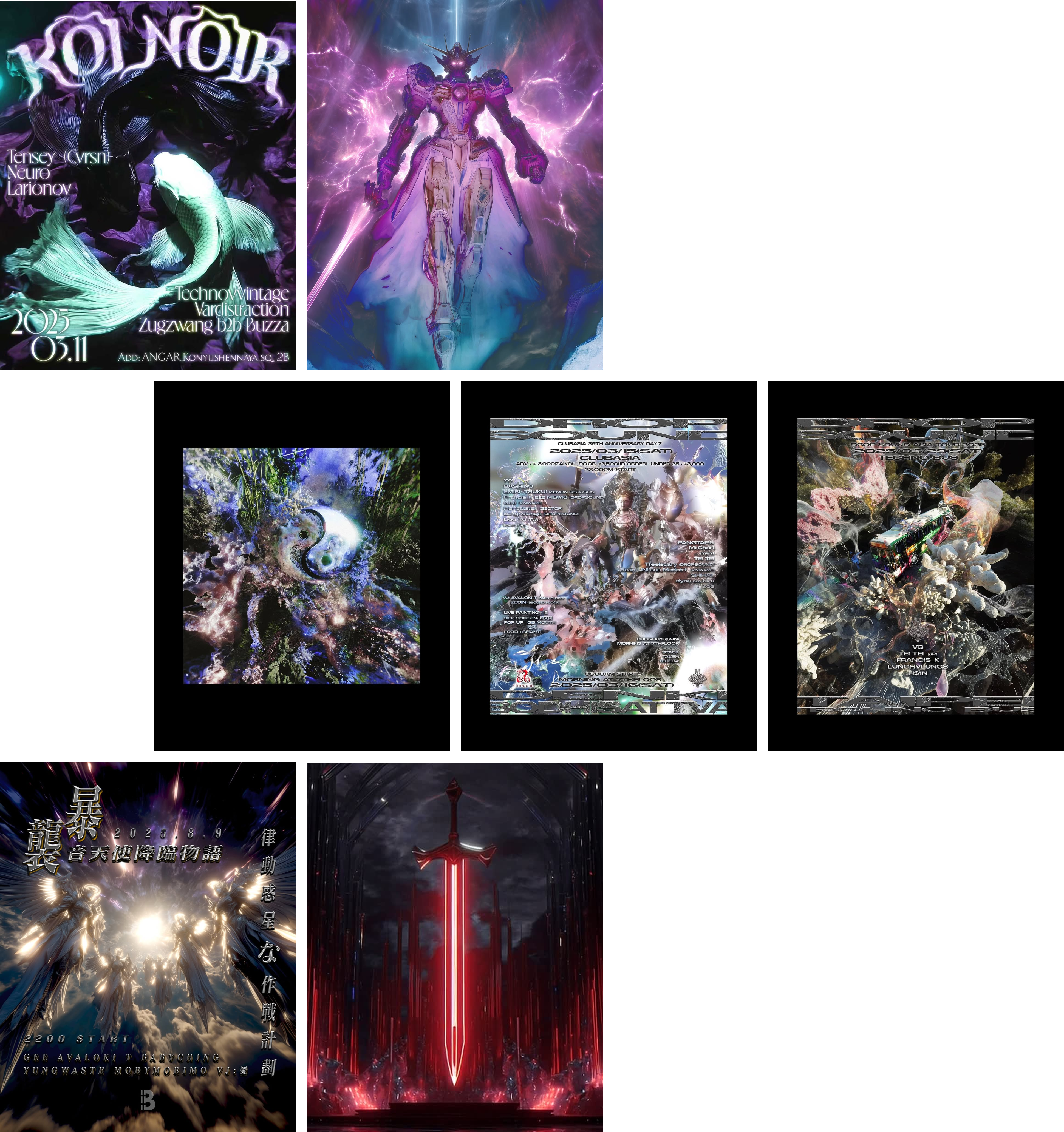
You could connect the SEGA-esque influences in Asian rave posters to the outsized role of Japanese culture in the region, or to how the Asia-Pacific accounts for the largest share of revenue for anime companies. You might say that combining myth and futurism is apt in Asia, where many cities are often described as a mix of “past” and “future,” on account of their rapid modernization. Or, you could attribute the use of bright, glowing objects to the prevalence of light pollution in several Asian cities.
There is a lot to learn about cities from their rave posters. When most visual culture today feels like it’s either advertising a product or that it exists exclusively for internet consumption, rave posters are one of few remaining visual forms that tether you to real people and real life. Instead of products or slop, they’re marketing real-life events and experiences and communities, and so are far more in tune with attitudes and realities on the ground. That makes rave posters especially privy to how a city changes, to the wider forces and tensions that shape it. Whether that’s a city’s transformation from industrial to post-industrial, or from British colony to Special Administrative Region of China, what else can we learn from them when we take a second look?

Great write up. Also particularly love the rave posters from a Shenzhen club called OIL
awesome. Makes me think of Berlin's rave posters post-reunification. Kinda rough, low-fi, a little grainy with a photocopied aesthetic, capturing the mixed sense of both decay and possibility in a city that was rebuilding out of two collapsed systems